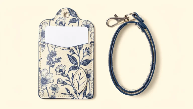

Images are AI-generated design concepts, not production photographs or approved Xinchao specifications. PU denotes synthetic leather, not genuine leather.
A custom souvenir pass case needs to do two jobs: remind someone of a place or occasion, and carry their cards comfortably after the visit. Start with one recognizable visual idea, then build the pocket layout, print area and outer shape around the intended use. Adding more landmarks or more pockets does not automatically make a better souvenir.
For Japanese-market retail goods and promotional gifts, the brief should also distinguish a product sold in a shop from an item handed out at an event. Both may use full-color printed leather or PU, but the presentation, information and approval process can differ. This guide focuses on that design brief, not a promise of sales performance or a fixed production quantity.
Decide what the recipient should remember
Choose a primary motif before assembling the artwork. It might be a locally approved illustration, a landscape, a garden, an original mascot or a detail associated with a venue. Give that motif a clear place on the front. Secondary patterns can support it without competing for the limited card-sized surface.
Venue-themed card holders are an established product idea. For example, the Ghibli Museum's official shop describes leather pass cases inspired by its shop character and the museum's exterior. This is an example of a location translated into a product, not permission to reuse those designs or evidence of a Xinchao collaboration. Develop original artwork or use assets cleared by the relevant owner.
Write a one-sentence design objective such as: “The front should recall the harbor, while the back carries two everyday cards.” This is more actionable than “make it Japanese-style.” It also helps reviewers decide which details matter when space becomes tight.
Separate retail souvenirs from promotional gifts
A retail buyer may want a coordinated collection and a clear way to show the product's reverse side. An event organizer may prioritize easy distribution and a prominent anniversary reference. Neither goal establishes a universal pocket count or material choice.
| Planning question | Retail souvenir proposal | Promotional gift proposal |
|---|---|---|
| Main visual purpose | Recall a place and support a cohesive display | Connect the item to the event or organization |
| Information location | Keep the front readable; use backing material for supporting detail | Decide which event details belong on the product and which belong on the insert |
| Card-carrying task | Define the intended everyday card combination | Confirm whether the recipient needs display, storage or frequent removal |
| Approval responsibility | Identify the artwork and merchandise reviewers | Identify the organizer's text and design approvers |
These are planning options, not rules about what either audience will buy. If the campaign has a fixed distribution date, work backward with confirmed approval, production and delivery stages. Do not assume the design can be changed freely after the physical sample is approved.
Keep the story visible when the holder is loaded
Draw the artwork and storage on the same sheet. Mark the front, back, opening direction, window, stitching and attachment point. Then show the intended cards inserted. A scenic composition may look complete on an empty case while a protruding card, strap or pocket lip hides its key detail during use.
A one-pocket layout can reserve a large illustrated front with storage on the reverse. Two pockets can separate an ID from another card, provided the openings and required information remain accessible. Three to five independent pockets can be considered for a different carrying brief, but additional storage should answer a real need rather than serve as decoration.
Confirm actual card dimensions and thicknesses. “Two cards” does not necessarily mean two separate slots, and a decorative stitched panel does not count as a pocket without a usable opening. Our pass case pocket-layout guide explains those distinctions in more detail.
For a windowed reverse, decide which part of the card must be readable. Avoid placing a printed border over that information merely to match the front illustration. If the product is meant to display a badge continuously, check how it hangs; a design intended to sit inside a bag can be reviewed against a different use sequence.

Let the outline support the illustration
An irregular outer shape can echo a roof, wave or mountain crest without changing the rectangular space the card needs. Start with the card cavity and seam layout, then explore the decorative contour outside that functional area. A visually interesting extension is not useful if it narrows the opening or catches against the strap.
Use broad, readable shapes in the concept stage. Ask the manufacturer to review narrow projections, internal corners and the attachment area before treating the outline as final. There is no universal minimum radius or seam allowance established by the word “die-cut”; the selected material and construction need a confirmed drawing.
For a layered effect, a separately cut thin printed panel can place a sun, leaf or other original motif over the base. Specify its material, edge treatment and attachment independently. A physical panel creates a real step; a shadow printed on a flat surface does not. Neither is automatically a 3D-printed part.
Keep the added layer away from the card opening unless a sample demonstrates that the arrangement works. Show the back of the proposed attachment too, so that a decorative choice does not introduce an unexpected obstruction inside the pocket. The printed and layered pass case guide provides a broader comparison of these visual approaches.
Plan the text as carefully as the illustration
Decide whether the product needs a place name, event year or short phrase. If the scenic artwork communicates the idea on its own, supporting text can be considered for a backing card rather than squeezed into the smallest available space. If a date is essential, approve it explicitly and decide whether it belongs on every future edition.
For Japanese text, keep a final editable source and an approved production version. Ask the responsible reviewer to confirm spelling, character choice, line breaks and the relationship between any Japanese and English names. A generated product image is not an approved lettering proof.
Inspect the text at the intended physical size and on the selected print surface. Do not assume a phrase that looks clear on a large monitor will remain clear over a textured material, near a seam or against a busy background. Use the supplier's confirmed artwork requirements rather than inventing a universal font size.
If a QR code is part of the brief, treat it as an additional functional element: confirm its destination and test the finished sample under the intended use conditions. Do not place an untested decorative code in a concept image and present it as ready for production.

Review the complete presentation, not just the front
For shop presentation, consider whether the shopper can understand that the item is a card holder. A front-facing scenic design may need a reverse-side image or a simple explanation on the backing card. Show the actual storage arrangement instead of implying a capacity that has not been confirmed.
Specify the material accurately. PU is synthetic leather, not genuine leather. If the proposed body uses genuine leather, record the agreed material and finish separately. Neither a textured render nor a reference photograph establishes the composition of the eventual product.
Keep the description limited to verified features. Do not claim waterproofing, RFID protection, universal transit-card compatibility or a service life based on appearance. Adding pockets or a window does not establish those functions. Product care wording should likewise follow the confirmed material and printing specifications.
For a series, give each artwork a stable code and pair it with the correct backing card or insert. If the shape and pocket layout are shared, record that common specification. If they differ, flag the difference rather than letting it disappear inside a mixed artwork folder. The small-batch multi-design guide covers the quantity and variant table.
Approve a souvenir sample in two passes
First review recognition and presentation: is the primary motif clear, are the names and dates correct, and does the packed item communicate the intended story? Then review use: insert the intended cards, remove them, attach the strap if specified, and examine whether the illustration, window and layers still work together.
Record the material, artwork revision, pocket layout and loading condition used for approval. Photograph the front, reverse and side. List corrections separately from accepted features so the next sample does not accidentally change something already agreed.
If you request rubbing, repeated insertion or attachment checks, agree on the method and acceptance criteria. This article proposes purchasing checks; it does not claim that a particular design has already passed a test. Final dimensions, construction, quantity conditions and schedule remain subject to confirmation.
The Xinchao leather card holder product page is a starting point for discussing the product direction. A useful inquiry includes the intended audience, original artwork, required card use, pocket count, material, outline, decorative layers, packaging, quantity per design and required arrival date.
FAQ
What should lead the design of a souvenir pass case?
Start with one recognizable motif and a defined card-carrying task. Build the artwork, pockets and presentation together so the product remains understandable and usable after the visit or event.
Can a souvenir pass case have an irregular shape?
Yes, an irregular contour can be proposed outside the functional card area. Confirm the card cavity, seams, opening and attachment point before approving decorative projections or a new cut outline.
Is one pocket the only option for printed souvenir card holders?
No. One- and two-pocket layouts are useful starting points, and three to five independent pockets can be discussed where the intended use calls for them. The final structure and capacity need drawing and sample confirmation.
Can an illustration be raised above the printed base?
A separate thin printed panel can be considered as an attached decorative layer. Specify its material and attachment, and check that it does not obstruct card access. Printed shadows alone do not create a physical layer.
Does the artwork proof also approve the finished product?
No. A proof can confirm the artwork revision, but the chosen material, printed appearance, card fit, attachment and packaging need their own agreed checks. Record which features each approval covers.
To discuss a souvenir or promotional pass case, send Xinchao your original visual concept and card-use brief so the illustration and practical construction can be reviewed together.